This is a logo proposal.
The old logo is here:
{F10999}
| F12003: ic.jpg | |
| Mar 16 2020, 14:47 |
| F11424: immagine.png | |
| Mar 12 2020, 16:46 |
| F11419: ic_launcher.png | |
| Mar 12 2020, 16:30 |
| F11362: 2.png | |
| Mar 11 2020, 16:44 |
| F11359: 1.png | |
| Mar 11 2020, 16:34 |
| F11351: 2.png | |
| Mar 11 2020, 16:30 |
| F11350: 1.png | |
| Mar 11 2020, 16:30 |
| F11357: 1.png | |
| Mar 11 2020, 16:30 |
This is a logo proposal.
The old logo is here:
{F10999}
Alternative abstract version:

Main color alternative:

Tested other color palettes, ask if needed
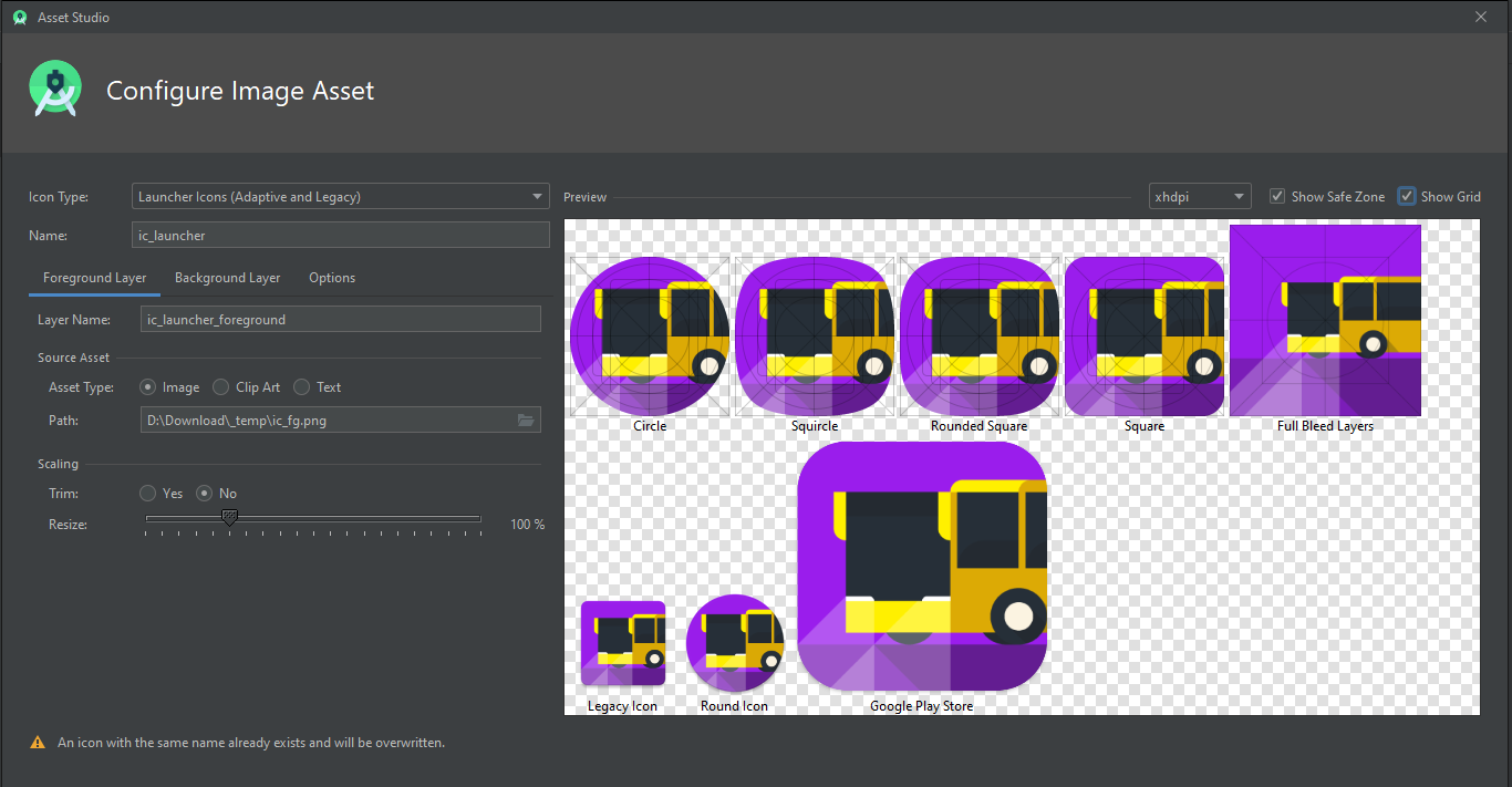
Done some testing on custom launcher

I've changed the color palette in order to make the yellow more prominent while keeping the lighting scene consistent. To generate all the necessary assets I've used Android Studio. The result follows the latest Material Design guidelines (adaptive icons...).
Dove si può prendere la versione in vettoriale? o farne una con il background quadrato?
Just some ideas.
Somehow these "O" can coincide.
Maybe the bus can be bigger, like it was crossing the logo.