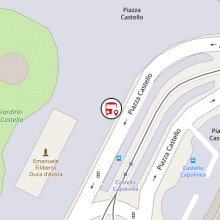
While we are actively working on T15: Show in-app map we noticed that OSMDroid is absolutely a pain in the eyes and has very poor design choices. We absolutely need to design a new Poin Of Interest icon, because the default one is shitty.
Personally, I started from the work of @andrea.ugo on this icon that is somehow interesting:
And I make this mock-up with GIMP just adding two circles around it, in order to give more contrast with the background:
This task is about improving the M9 mockup. The accepted mockup will be then exported in SVG. We will have to somehow put that SVG in the res/drawable/map.xml file (that will be available after D24: Add in-app map! approval).

